Devices
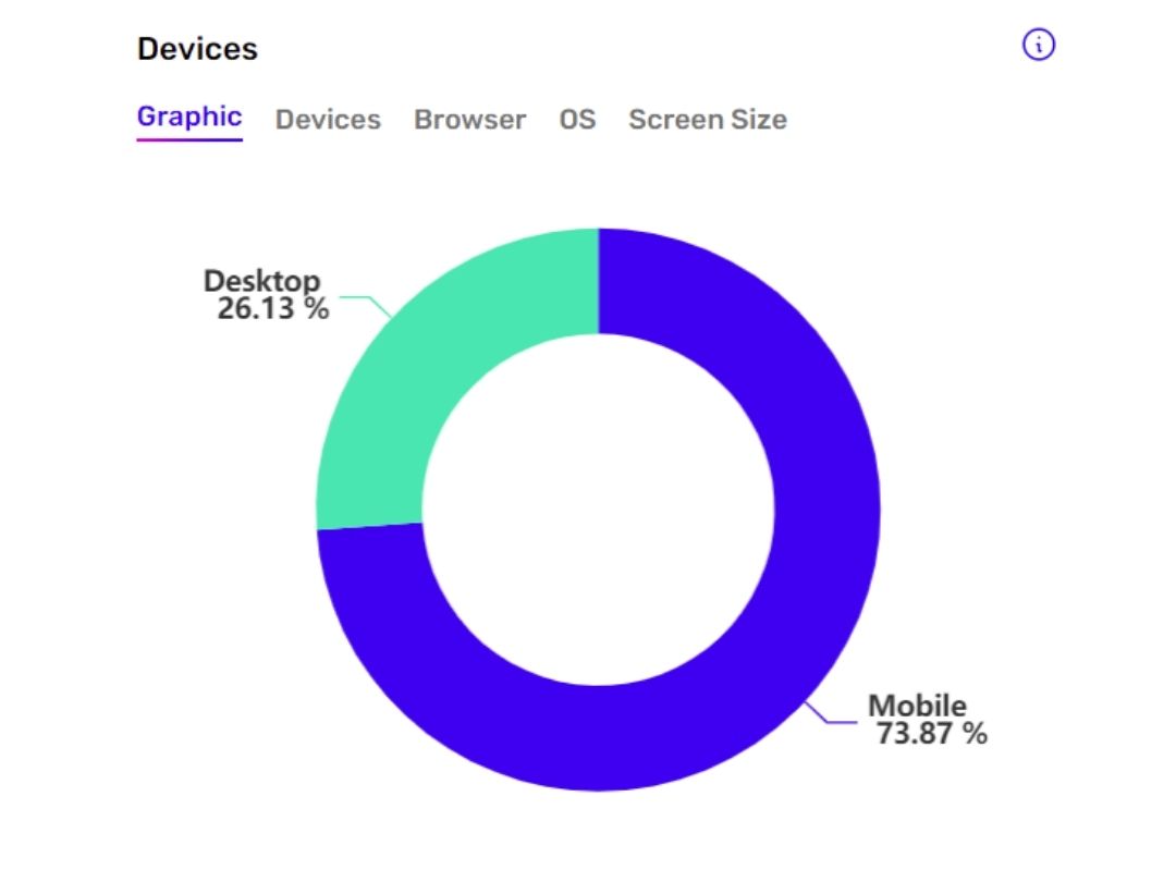
The widget, expressed as a pie chart, shows information about the screen, browser and operating system (OS) used by visitors. It is useful for understanding the type of device most used by users and optimizing the site according to this. If, for example, you have an ecommerce business visited predominantly by mobile-type devices, you'll want to invest resources to provide a site that is fast and intuitive to navigate on small screens.
The other tabs in the Devices widget are:
- Device: the types of devices that Vantevo analyzes are 4: 1) desktop 2) mobile 3) tablet 4) unknown = this is a device that could not be classified as one of the previous three
- Browser: the name of the software that provides access to the Internet through a search engine, i.e., a specific user interface, example Chrome, Edge, Safari, Opera, Firefox, etc.
- OS: Operating System, indicates the operating system used by your users, whether desktop or mobile. E.g. IOS, Android, Windows, Linux etc.
- Screen Size: the screen size that your users use. To figure out the exact size, refer to the following table:
| Screen | Dimension |
|---|---|
| UHD 5K | width > 3840 |
| UHD 4K | width > 2560 e width <= 3840 |
| WQHD | width > 1920 e width <= 2560 |
| Full HD | width > 1280 e width <= 1920 |
| HD | width > 1024 e width <= 1280 |
| XL | width > 800 e width <= 1024 |
| L | width > 600 e width <= 800 |
| M | width > 415 e width <= 600 |
| S | width < 415 |